spike wrote:
Brewers have new spring training unis; I want this cap. Classic logo blended with new colors.

chuck taylor wrote:
Love that Brewers logo.
Top 5 most clever logos in sports.
I can't think of 4 others off the top of my head.
| Red Mosquito http://forums.theskyiscrape.com/ |
|
| Lament's Uniform Aesthetics Thread... http://forums.theskyiscrape.com/viewtopic.php?f=4&t=13403 |
Page 21 of 24 |
| Author: | Bammer [ Sun January 31, 2016 4:55 am ] |
| Post subject: | Re: Lament's Uniform Aesthetics Thread... |
spike wrote: Brewers have new spring training unis; I want this cap. Classic logo blended with new colors. chuck taylor wrote: Love that Brewers logo. Top 5 most clever logos in sports. I can't think of 4 others off the top of my head. |
|
| Author: | numbers [ Sun January 31, 2016 1:36 pm ] |
| Post subject: | Re: Lament's Uniform Aesthetics Thread... |
A lot of the new spring training unis are fire. Love the 70s style Red Sox hats. |
|
| Author: | spike [ Sun January 31, 2016 2:22 pm ] |
| Post subject: | Re: Lament's Uniform Aesthetics Thread... |
numbers wrote: A lot of the new spring training unis are fire. Love the 70s style Red Sox hats. http://www.sbnation.com/mlb/2016/1/28/1 ... best-worst |
|
| Author: | Green Habit [ Sun January 31, 2016 2:31 pm ] |
| Post subject: | Re: Lament's Uniform Aesthetics Thread... |
Brewers hat needs royal blue instead of the overused navy blue, but if that's the tradeoff to get that awesome logo back, so be it. |
|
| Author: | spike [ Sun January 31, 2016 3:08 pm ] |
| Post subject: | Re: Lament's Uniform Aesthetics Thread... |
Green Habit wrote: Brewers hat needs royal blue instead of the overused navy blue, but if that's the tradeoff to get that awesome logo back, so be it. They've been wearing the old royal blue hats w logo and pinstripes for select games for years now. |
|
| Author: | Green Habit [ Sun January 31, 2016 3:59 pm ] |
| Post subject: | Re: Lament's Uniform Aesthetics Thread... |
spike wrote: Green Habit wrote: Brewers hat needs royal blue instead of the overused navy blue, but if that's the tradeoff to get that awesome logo back, so be it. They've been wearing the old royal blue hats w logo and pinstripes for select games for years now. |
|
| Author: | PHATJ [ Sun January 31, 2016 4:31 pm ] |
| Post subject: | Re: Lament's Uniform Aesthetics Thread... |
The Twins announced a new red jersey a few days ago. I'm on my iPad and I can't grab the image to post here. http://www.kare11.com/sports/twins-unve ... m/24276336 |
|
| Author: | Norris [ Mon February 01, 2016 2:58 am ] |
| Post subject: | Re: Lament's Uniform Aesthetics Thread... |
Bammer wrote: spike wrote: Brewers have new spring training unis; I want this cap. Classic logo blended with new colors. chuck taylor wrote: Love that Brewers logo. Top 5 most clever logos in sports. I can't think of 4 others off the top of my head. |
|
| Author: | Norris [ Mon February 01, 2016 2:59 am ] |
| Post subject: | Re: Lament's Uniform Aesthetics Thread... |
spike wrote: numbers wrote: A lot of the new spring training unis are fire. Love the 70s style Red Sox hats. http://www.sbnation.com/mlb/2016/1/28/1 ... best-worst those are dope |
|
| Author: | Bammer [ Mon February 01, 2016 5:37 am ] |
| Post subject: | Re: Lament's Uniform Aesthetics Thread... |
The Mariners compass logo makes me want to puke. |
|
| Author: | Monkey_Driven [ Mon February 01, 2016 3:19 pm ] |
| Post subject: | Re: Lament's Uniform Aesthetics Thread... |
That Royals spring training hat is pretty cool too. |
|
| Author: | numbers [ Mon February 01, 2016 5:51 pm ] |
| Post subject: | Re: Lament's Uniform Aesthetics Thread... |
If it didn't have that gaudy FL patch on the side of pick up that Red Sox hat without thinking twice. |
|
| Author: | darth_vedder [ Thu March 03, 2016 3:06 am ] |
| Post subject: | Re: Lament's Uniform Aesthetics Thread... |
I'm a big fan of the Capital's throwbacks: 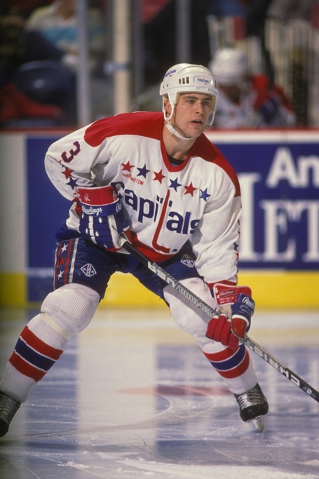
|
|
| Author: | darth_vedder [ Thu March 03, 2016 3:08 am ] |
| Post subject: | Re: Lament's Uniform Aesthetics Thread... |
reminds me, i liked the washington bullets throwbacks too: 
|
|
| Author: | Monkey_Driven [ Thu March 03, 2016 3:03 pm ] |
| Post subject: | Re: Lament's Uniform Aesthetics Thread... |
These are sweet... 
|
|
| Author: | CopperTom [ Fri March 18, 2016 11:03 pm ] |
| Post subject: | Re: Lament's Uniform Aesthetics Thread... |
I love the cheapness of mid-major's uniforms. |
|
| Author: | Norris [ Sat March 19, 2016 9:45 pm ] |
| Post subject: | Re: Lament's Uniform Aesthetics Thread... |
| Author: | Green Habit [ Tue September 13, 2016 5:23 pm ] |
| Post subject: | Re: Lament's Uniform Aesthetics Thread... |
OK, here's my verdict on all the Color Rush jerseys: --Good: Broncos, Chargers, Giants, Vikings, Saints, Falcons, Seahawks (I know most people won't like that one, though), Cowboys --Meh: Dolphins, Steelers, Bengals, Texans, Rams (kinda bad but I just like the yellow way more than that ugly mustard gold) --Was there really any change?: Chiefs, Raiders, Packers, Patriots, Bears, Colts --Bad: Ravens, Eagles, Browns, Lions, Jaguars, Titans, Cardinals, 49ers, Redskins, Bills, Jets |
|
| Author: | numbers [ Tue September 13, 2016 5:40 pm ] |
| Post subject: | Re: Lament's Uniform Aesthetics Thread... |
I dont understand why they Patriots didnt go for all red. |
|
| Author: | Green Habit [ Tue September 13, 2016 8:18 pm ] |
| Post subject: | Re: Lament's Uniform Aesthetics Thread... |
numbers wrote: I dont understand why they Patriots didnt go for all red. 
|
|
| Page 21 of 24 | All times are UTC |
| Powered by phpBB © 2000, 2002, 2005, 2007 phpBB Group http://www.phpbb.com/ |
|